Mapping Time Series Dissimilarity
Source:vignettes/articles/mapping_dissimilarity.Rmd
mapping_dissimilarity.RmdSummary
This article showcases different spatial representations of the
outputs of distantia() and momentum().
Mapping Results of distantia() Functions
The functions with the prefix distantia quantify time
series dissimilarity and provide results that can be represented as
maps.
Example Data
The examples in this article illustrate how to map dissimilarity
scores using the datasets covid_prevalence and
covid_counties included with distantia. The
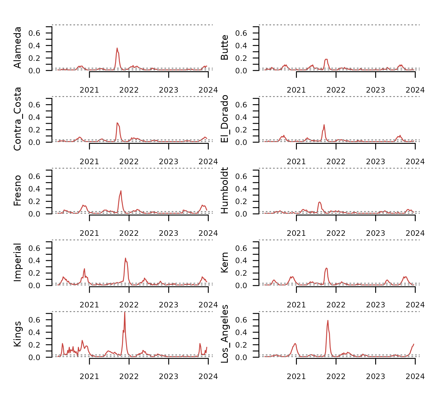
dataset comprises time series of weekly Covid-19 prevalence in several
California counties.
tsl <- distantia::tsl_initialize(
x = distantia::covid_prevalence,
name_column = "name",
time_column = "time"
)
distantia::tsl_plot(
tsl = tsl[1:10],
columns = 2,
guide = FALSE
) The map below displays the polygons in
distantia::covid_counties using mapview().
mapview::mapview(
distantia::covid_counties,
label = "name"
)Dissimilarity Analysis
The code in this section prepares several datasets to use in the different mapping examples:
-
df_psi: a lock-step dissimilarity data frame with psi scores and p-values from restricted permutation tests. -
df_stats: dissimilarity stats of each time series against all others. -
df_cluster: a hierarchical clustering based on the dissimilarity scores indf_psi.
The lock-step dissimilarity analysis shown below includes p-values from a restricted permutation test. These p-values will be useful as criteria to select relevant mapping features.
#parallelization setup
future::plan(
future::multisession,
workers = parallelly::availableCores() - 1
)
#lock-step dissimilarity analysis
df_psi <- distantia::distantia(
tsl = tsl,
distance = "euclidean",
lock_step = TRUE,
repetitions = 1000,
permutation = "restricted",
block_size = 12 #weeks
)
#disable parallelization
future::plan(
future::sequential
)
#check resulting data frame
df_psi |>
dplyr::select(x, y, psi, p_value) |>
dplyr::glimpse()
#> Rows: 630
#> Columns: 4
#> $ x <chr> "Napa", "Alameda", "Alameda", "Sacramento", "San_Joaquin", "Sa…
#> $ y <chr> "Solano", "San_Mateo", "Contra_Costa", "Sonoma", "Stanislaus",…
#> $ psi <dbl> 0.8726115, 1.0656371, 1.1620553, 1.2578125, 1.2919255, 1.29793…
#> $ p_value <dbl> 0.001, 0.001, 0.001, 0.001, 0.001, 0.001, 0.001, 0.001, 0.001,…The code below aggregates psi scores in the data frame
df_psi to summarize the overall dissimilarity of each time
series with all others.
df_stats <- distantia::distantia_stats(
df = df_psi
)
df_stats |>
dplyr::select(
name, mean
) |>
dplyr::glimpse()
#> Rows: 36
#> Columns: 2
#> $ name <chr> "Alameda", "Butte", "Contra_Costa", "El_Dorado", "Fresno", "Humbo…
#> $ mean <dbl> 3.214531, 3.266749, 3.358524, 3.546757, 3.270684, 4.028824, 3.834…The function distantia_cluster_hclust() runs a
hierarchical clustering using the psi scores in
df_psi as clustering criteria.
df_cluster <- distantia::distantia_cluster_hclust(
df = df_psi
)$df
df_cluster |>
dplyr::select(name, cluster) |>
dplyr::glimpse()
#> Rows: 36
#> Columns: 2
#> $ name <chr> "Napa", "Alameda", "Sacramento", "San_Joaquin", "Santa_Clara",…
#> $ cluster <dbl> 1, 2, 2, 1, 3, 2, 2, 3, 2, 1, 1, 1, 2, 1, 2, 4, 2, 1, 1, 1, 2,…Network Map
The function distantia_spatial() transforms the result
of distantia() to an sf data frame with edges connecting
time series coordinates or polygons. The result can be interpreted as a
dissimilarity network.
sf_network <- distantia::distantia_spatial(
df = df_psi,
sf = distantia::covid_counties |>
dplyr::select(
name, geometry
),
network = TRUE
)
dplyr::glimpse(sf_network)
#> Rows: 630
#> Columns: 9
#> $ edge_name <chr> "Alameda - Butte", "Alameda - Contra_Costa", "Butte - Contra…
#> $ y <chr> "Butte", "Contra_Costa", "Contra_Costa", "El_Dorado", "El_Do…
#> $ x <chr> "Alameda", "Alameda", "Butte", "Contra_Costa", "Butte", "Ala…
#> $ psi <dbl> 2.962963, 1.162055, 2.733068, 2.767442, 2.327273, 2.483755, …
#> $ p_value <dbl> 0.048, 0.001, 0.001, 0.016, 0.005, 0.002, 0.045, 0.334, 1.00…
#> $ null_mean <dbl> 3.253452, 2.442545, 3.453084, 3.273194, 2.857149, 3.050181, …
#> $ null_sd <dbl> 0.16577079, 0.27674638, 0.20054408, 0.22631966, 0.19082565, …
#> $ geometry <LINESTRING [°]> LINESTRING (-121.8869 37.64..., LINESTRING (-121.…
#> $ length <dbl> 226007.5, 30278.1, 196579.9, 155203.7, 135288.6, 173206.4, 3…The resulting sf data frame has a field with the edge name, the
columns x and y with the names of the
connected time series, the psi scores and p-values of the
dissimilarity data frame, a geometry column of type LINESTRING defining
the network edges, and the length of the edges.
This sf data frame can be mapped right away, but in this case there are too many pairs of counties to achieve a meaningful map.
mapview::mapview(
sf_network,
layer.name = "Psi",
label = "edge_name",
zcol = "psi",
color = distantia::color_continuous()
)Focusing on particular aspects of the data at hand may help untangle this mess. For example, the code below subsets edges connecting with San Francisco and its most similar counties in terms of Covid19 prevalence.
#select pairs of counties
counties <- c(
"Los_Angeles",
"San_Francisco",
"Fresno",
"San_Joaquin",
"Monterey"
)
sf_network_subset <- sf_network[
which(
sf_network$x %in% counties &
sf_network$y %in% counties
),
]
#map country polygons and dissimilarity edges
mapview::mapview(
covid_counties,
col.regions = NA,
alpha.regions = 0,
color = "black",
label = "name",
legend = FALSE,
map.type = "OpenStreetMap"
) +
mapview::mapview(
sf_network_subset,
layer.name = "Psi",
label = "edge_name",
zcol = "psi",
lwd = 5,
color = distantia::color_continuous(
rev = TRUE
)
)The function distantia_spatial() also has a one-to-many
mode designed to help map the dissimilarity of one time series against
all others.
sf_network <- distantia::distantia_spatial(
df = df_psi,
sf = distantia::covid_counties |>
dplyr::select(
name, geometry
),
network = FALSE
)
dplyr::glimpse(sf_network)
#> Rows: 1,295
#> Columns: 7
#> $ x <chr> "Alameda", "Alameda", "Alameda", "Alameda", "Alameda", "Alam…
#> $ y <chr> "Alameda", "Butte", "Contra_Costa", "El_Dorado", "Fresno", "…
#> $ psi <dbl> 0.000000, 2.962963, 1.162055, 2.483755, 3.456869, 3.960000, …
#> $ p_value <dbl> 0.000, 0.048, 0.001, 0.002, 0.334, 0.984, 0.210, 0.120, 0.98…
#> $ null_mean <dbl> 0.000000, 3.253452, 2.442545, 3.050181, 3.565789, 3.638864, …
#> $ null_sd <dbl> 0.00000000, 0.16577079, 0.27674638, 0.20253761, 0.23818318, …
#> $ geometry <MULTIPOLYGON [°]> MULTIPOLYGON (((-121.9907 3..., MULTIPOLYGON ((…This option does not create edges, and instead uses the geometry
introduced in the sf argument. This sf data frame is mapped
as follows: when one site in the “x” column is selected, the result
shows the dissimilarity scores of all other sites against the selected
one.
#subset one county
sf_network_subset <- sf_network[
sf_network$x == "San_Francisco",
]
#one-to-many visualization
mapview::mapview(
sf_network_subset,
layer.name = "Psi",
label = "y",
zcol = "psi",
col.regions = distantia::color_continuous(
rev = TRUE
)
)Dissimilarity Stats Map
Mapping the dissimilarity stats of each time series may help identify places that are somewhat special because they show a high dissimilarity with all others, or places that are average and have no distinctive features.
Merging the dissimilarity stats with the sf data frame containing the county polygons generates the spatial data required for the map.
sf_stats <- merge(
x = distantia::covid_counties,
y = df_stats
) |>
dplyr::select(
mean,
name
)The map below uses warm colors to highlight places with a high dissimilarity with all others, such as Humboldt county in the north west of the state.
mapview::mapview(
sf_stats,
layer.name = "Psi mean",
zcol = "mean",
label = "name",
col.regions = distantia::color_continuous(
rev = TRUE
),
alpha.regions = 1
)Clustering Map
This section shows how to map the similarity groups resulting from
distantia::distantia_cluster_hclust() or
distantia::distantia_cluster_kmeans().
The first block in the code below joins the county polygons in
distantia::covid_counties with the clustering data frame
df_cluster. This block also generates the variable “alpha”
from the column “silhouette_width”, which represents the strength of
membership to the assigned clustering group.
The second block generates the map, using colors for cluster membership, and the variable alpha to encode the strength of membership. This setup allows identifying groups of similar counties while highlighting counties that somehow do not fully belong to their given group. This is the case of Butte, which is in the group 5, but with a very low silhouette score.
#join county polygons with clustering groups
sf_cluster <- distantia::covid_counties |>
dplyr::select(name, geometry) |>
dplyr::inner_join(
y = df_cluster,
by = "name"
) |>
#remap silhouette score to transparency values
dplyr::mutate(
alpha = f_rescale_local(
x = silhouette_width,
new_min = 0.1
)
)
mapview::mapview(
sf_cluster,
layer.name = "Group",
zcol = "cluster",
label = "name",
col.regions = distantia::color_continuous(
n = max(sf_cluster$cluster)
),
alpha.regions = sf_cluster$alpha
)Mapping Results of momentum()
The momentum functions quantify the contribution to
dissimilarity of individual variables in multivariate time series. The
results of momentum functions are slightly harder to map
due to a high cardinality (number of time series times number of
variables), but distantia provides some tools to face this
challenge.
Example Data
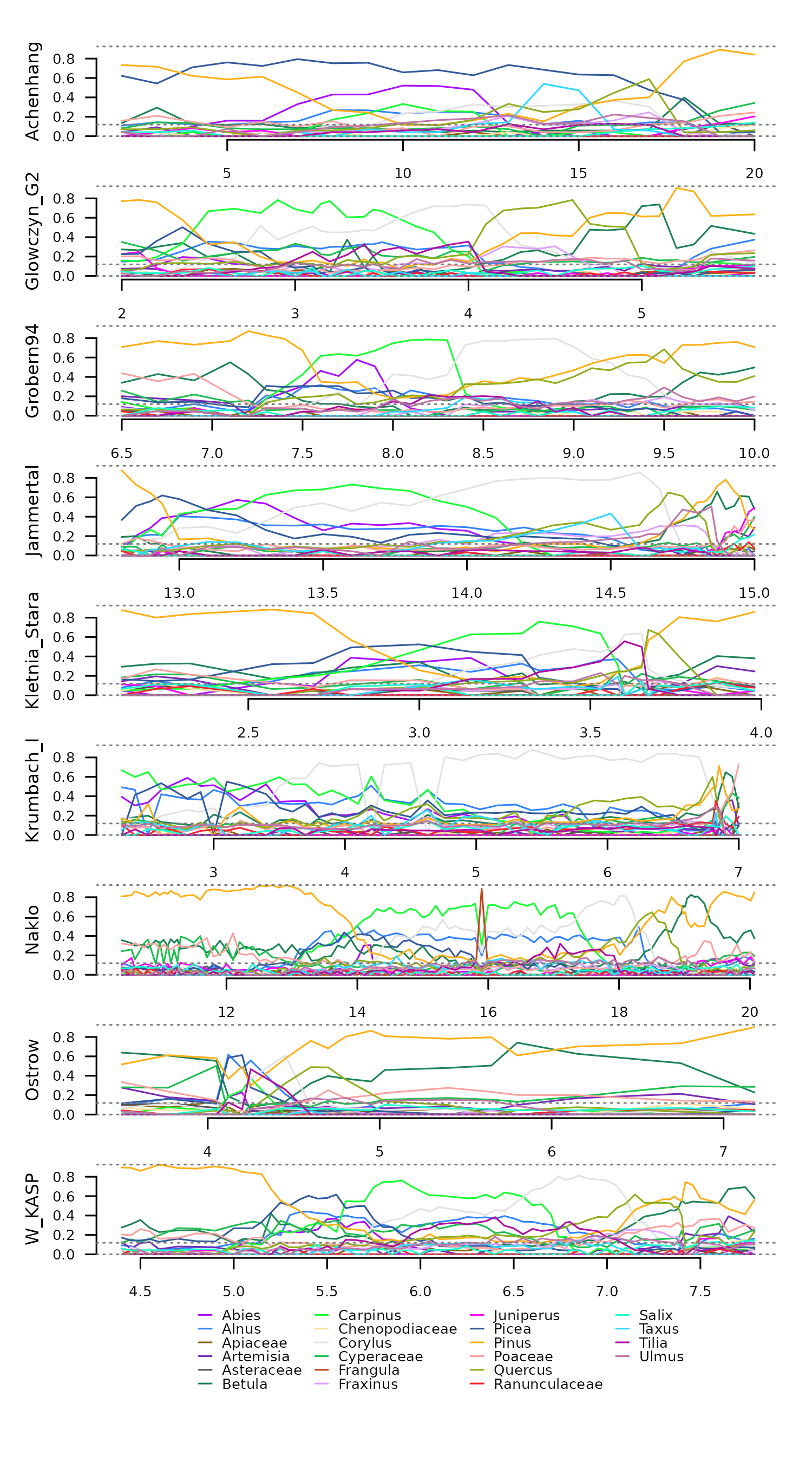
This example uses the data eemian_pollen and
eemian_coordinates, which comprises nine irregular time
series of pollen counts in Central Europe from the Last Interglacial
(Eemian period). This data requires a Hellinger transformation to
facilitate dissimilarity analyses.
tsl <- distantia::tsl_initialize(
x = distantia::eemian_pollen,
name_column = "name",
time_column = "time"
) |>
distantia::tsl_transform(
f = distantia::f_hellinger
)
#> distantia::utils_prepare_time(): duplicated time indices in 'Krumbach_I':
#> - value 6.8 replaced with 6.825.
distantia::tsl_plot(
tsl = tsl,
guide_columns = 4
)
Importance Analysis
The function momentum_dtw() computes variable importance
using a jackknife approach. The column “importance” represents
contribution to similarity and dissimilarity with negative and positive
values, respectively.
df_importance <- momentum_dtw(
tsl = tsl
)
head(df_importance, n = 20)
#> x y psi variable importance
#> 1 Achenhang Glowczyn_G2 3.703507 Pinus -67.080631
#> 2 Achenhang Glowczyn_G2 3.703507 Corylus 9.676750
#> 3 Achenhang Glowczyn_G2 3.703507 Carpinus 33.492641
#> 4 Achenhang Glowczyn_G2 3.703507 Betula -43.022468
#> 5 Achenhang Glowczyn_G2 3.703507 Quercus -55.260250
#> 6 Achenhang Glowczyn_G2 3.703507 Alnus -4.263397
#> 7 Achenhang Glowczyn_G2 3.703507 Picea 247.850696
#> 8 Achenhang Glowczyn_G2 3.703507 Poaceae -56.755172
#> 9 Achenhang Glowczyn_G2 3.703507 Cyperaceae 22.828821
#> 10 Achenhang Glowczyn_G2 3.703507 Abies 102.075066
#> 11 Achenhang Glowczyn_G2 3.703507 Ulmus -58.772493
#> 12 Achenhang Glowczyn_G2 3.703507 Tilia 8.132425
#> 13 Achenhang Glowczyn_G2 3.703507 Frangula 0.000000
#> 14 Achenhang Glowczyn_G2 3.703507 Artemisia -46.360957
#> 15 Achenhang Glowczyn_G2 3.703507 Fraxinus -61.642159
#> 16 Achenhang Glowczyn_G2 3.703507 Taxus -35.976319
#> 17 Achenhang Glowczyn_G2 3.703507 Juniperus -39.601393
#> 18 Achenhang Glowczyn_G2 3.703507 Chenopodiaceae -69.043427
#> 19 Achenhang Glowczyn_G2 3.703507 Salix -54.456046
#> 20 Achenhang Glowczyn_G2 3.703507 Asteraceae -60.049059
#> effect
#> 1 increases similarity
#> 2 decreases similarity
#> 3 decreases similarity
#> 4 increases similarity
#> 5 increases similarity
#> 6 increases similarity
#> 7 decreases similarity
#> 8 increases similarity
#> 9 decreases similarity
#> 10 decreases similarity
#> 11 increases similarity
#> 12 decreases similarity
#> 13 increases similarity
#> 14 increases similarity
#> 15 increases similarity
#> 16 increases similarity
#> 17 increases similarity
#> 18 increases similarity
#> 19 increases similarity
#> 20 increases similarityNetwork Map
The function momentum_spatial(), just like
distantia_spatial(), transforms the results of
momentum functions to an sf data frame with edges.
sf_network <- distantia::momentum_spatial(
df = df_importance,
sf = distantia::eemian_coordinates |>
dplyr::select(
name, geometry
),
network = TRUE
)
dplyr::glimpse(sf_network)
#> Rows: 36
#> Columns: 30
#> $ edge_name <chr> "Achenhang - Glowczyn_G2", "Achenhang - Gro…
#> $ y <chr> "Glowczyn_G2", "Grobern94", "Grobern94", "J…
#> $ x <chr> "Achenhang", "Achenhang", "Glowczyn_G2", "A…
#> $ psi <dbl> 3.703507, 3.489709, 2.076632, 3.204312, 2.2…
#> $ most_similarity <chr> "Chenopodiaceae", "Apiaceae", "Salix", "Que…
#> $ most_dissimilarity <chr> "Picea", "Picea", "Cyperaceae", "Picea", "J…
#> $ importance__Abies <dbl> 102.0750658, -3.7890809, 31.6222996, -6.339…
#> $ importance__Alnus <dbl> -4.263397, -52.810333, 17.090801, -28.97179…
#> $ importance__Apiaceae <dbl> -57.398554, -75.084127, -7.135823, -34.5046…
#> $ importance__Artemisia <dbl> -46.360957, -12.249132, -7.040055, -42.8159…
#> $ importance__Asteraceae <dbl> -60.0490590, -65.6509538, -19.6345045, -60.…
#> $ importance__Betula <dbl> -43.0224683, -35.3757037, -27.7092958, -3.8…
#> $ importance__Carpinus <dbl> 33.492641, 21.518114, -24.914337, 25.427683…
#> $ importance__Chenopodiaceae <dbl> -69.043427, -47.422851, -30.116905, -59.110…
#> $ importance__Corylus <dbl> 9.676750, 11.022477, -32.210648, 56.826297,…
#> $ importance__Cyperaceae <dbl> 22.8288208, -36.4111585, 136.6667217, -62.5…
#> $ importance__Frangula <dbl> 0.00000, 0.00000, 0.00000, 0.00000, 0.00000…
#> $ importance__Fraxinus <dbl> -61.6421587, -47.8929848, 30.1905227, -45.1…
#> $ importance__Juniperus <dbl> -39.6013934, -29.1748819, 104.4894455, -8.6…
#> $ importance__Picea <dbl> 247.850696, 267.635667, 41.815270, 245.7300…
#> $ importance__Pinus <dbl> -67.0806314, -38.0894327, 3.0638565, -37.74…
#> $ importance__Poaceae <dbl> -56.755172, -39.036160, 6.354846, -54.86584…
#> $ importance__Quercus <dbl> -55.26024973, -35.61050203, 26.90348695, -6…
#> $ importance__Ranunculaceae <dbl> -55.942707, -65.734744, -25.580045, -27.206…
#> $ importance__Salix <dbl> -54.45605, -63.81673, -44.30718, -45.18432,…
#> $ importance__Taxus <dbl> -35.9763194, -47.8640761, 45.9226941, -43.7…
#> $ importance__Tilia <dbl> 8.1324252, -22.6808392, -22.5884817, -42.04…
#> $ importance__Ulmus <dbl> -58.7724933, -57.2728168, -36.6160709, -23.…
#> $ geometry <LINESTRING [°]> LINESTRING (12.19381 47.753..., …
#> $ length <dbl> 771512.45, 437377.26, 536559.23, 187660.13,…Notice that it separates the importance of each variable to a separate column, and also has two character columns named “most_similarity” and “most_dissimilarity” with the names of the variables with the highest and lowest importance scores.
The map below shows the pairs of most similar time series connected with edges coded after the name of the variable that contributes the most to their similarity.
mapview::mapview(
distantia::eemian_coordinates,
layer.name = "Eemian sites - m.a.s.l",
label = "name",
zcol = "elevation",
col.regions = distantia::color_continuous()
) +
mapview::mapview(
sf_network |>
dplyr::filter(
psi < mean(psi)
),
layer.name = "Contributes to Similarity",
label = "most_similarity",
zcol = "most_similarity",
color = distantia::color_discrete(
n = length(unique(sf_network$most_similarity))
)
)Filtering the input even further allows to focus on specific features of the dataset at hand. For example, the map below highlights pairs of time series with high similarity driven mostly by the taxa “Frangula”.
mapview::mapview(
distantia::eemian_coordinates,
layer.name = "Eemian sites - m.a.s.l",
label = "name",
zcol = "elevation",
col.regions = distantia::color_continuous()
) +
mapview::mapview(
sf_network |>
dplyr::filter(
psi < mean(psi),
most_similarity == "Frangula"
),
layer.name = "Contributes to Similarity",
label = "most_similarity",
zcol = "most_similarity",
color = distantia::color_discrete(
n = 1
)
)Conversely, we can also map what variable makes these sites more different.
mapview::mapview(
distantia::eemian_coordinates,
layer.name = "Eemian sites - m.a.s.l",
label = "name",
zcol = "elevation",
col.regions = distantia::color_continuous()
) +
mapview::mapview(
sf_network |>
dplyr::filter(
psi < mean(psi),
most_similarity == "Frangula"
),
layer.name = "Contributes to Dissimilarity",
label = "most_dissimilarity",
zcol = "most_dissimilarity",
color = distantia::color_discrete(
n = length(unique(sf_network$most_dissimilarity))
)
)